Travel Mate.
Group travel planning app
- UX Design
- Developer Collaboration
- App Design
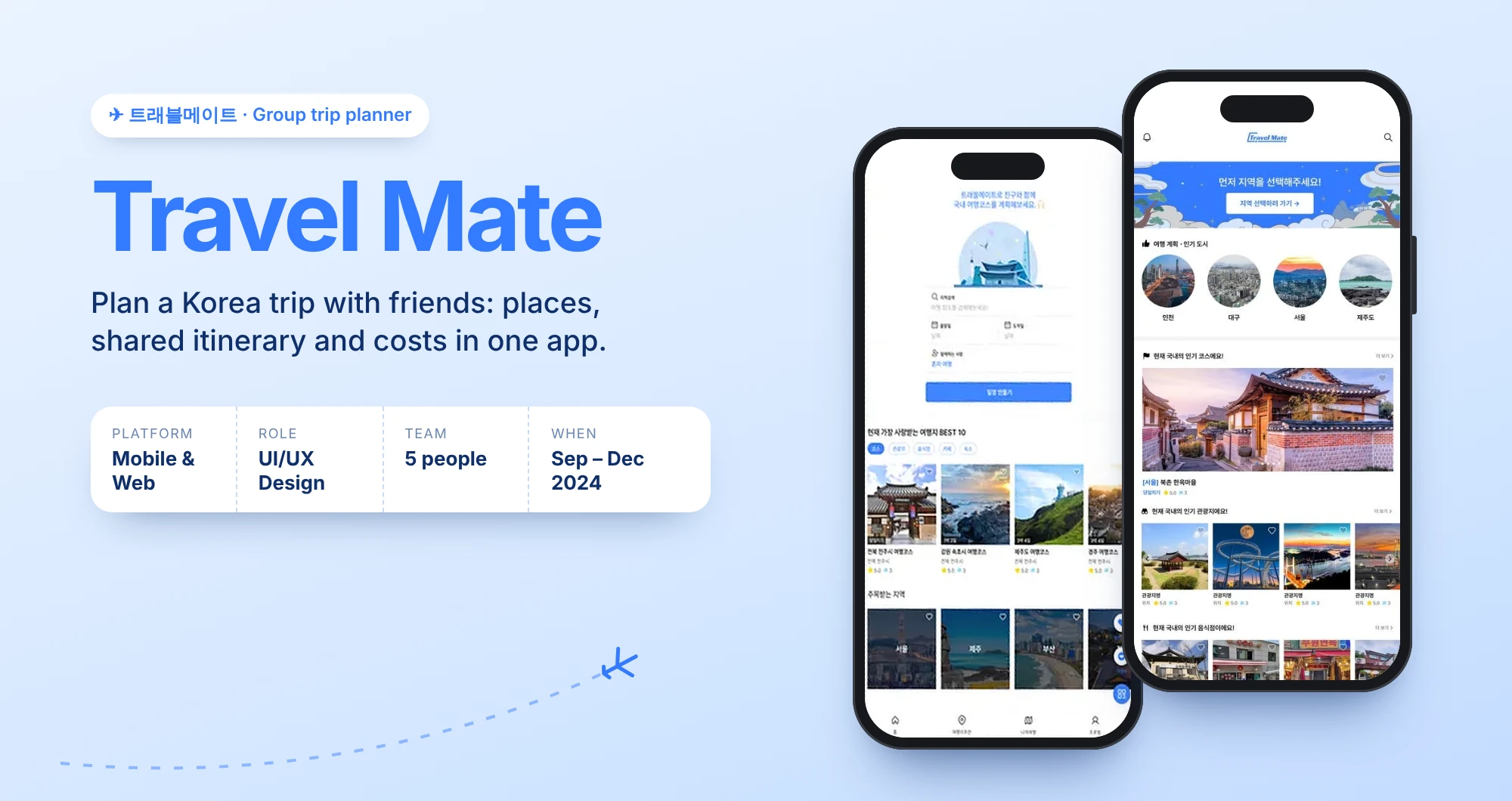
With a team of designers and developers, I helped build Travel Mate, an app that makes planning a trip to Korea with friends simple. Available in English and Korean.
Planning with friends means switching between apps and endless back-and-forth.
One app to search places, build shared itineraries and track expenses together.
A functional web and mobile product, refined over 16 iterations.
At a glance
Research
Surveys, user data and benchmarking of comparable apps’ UI and information architecture.
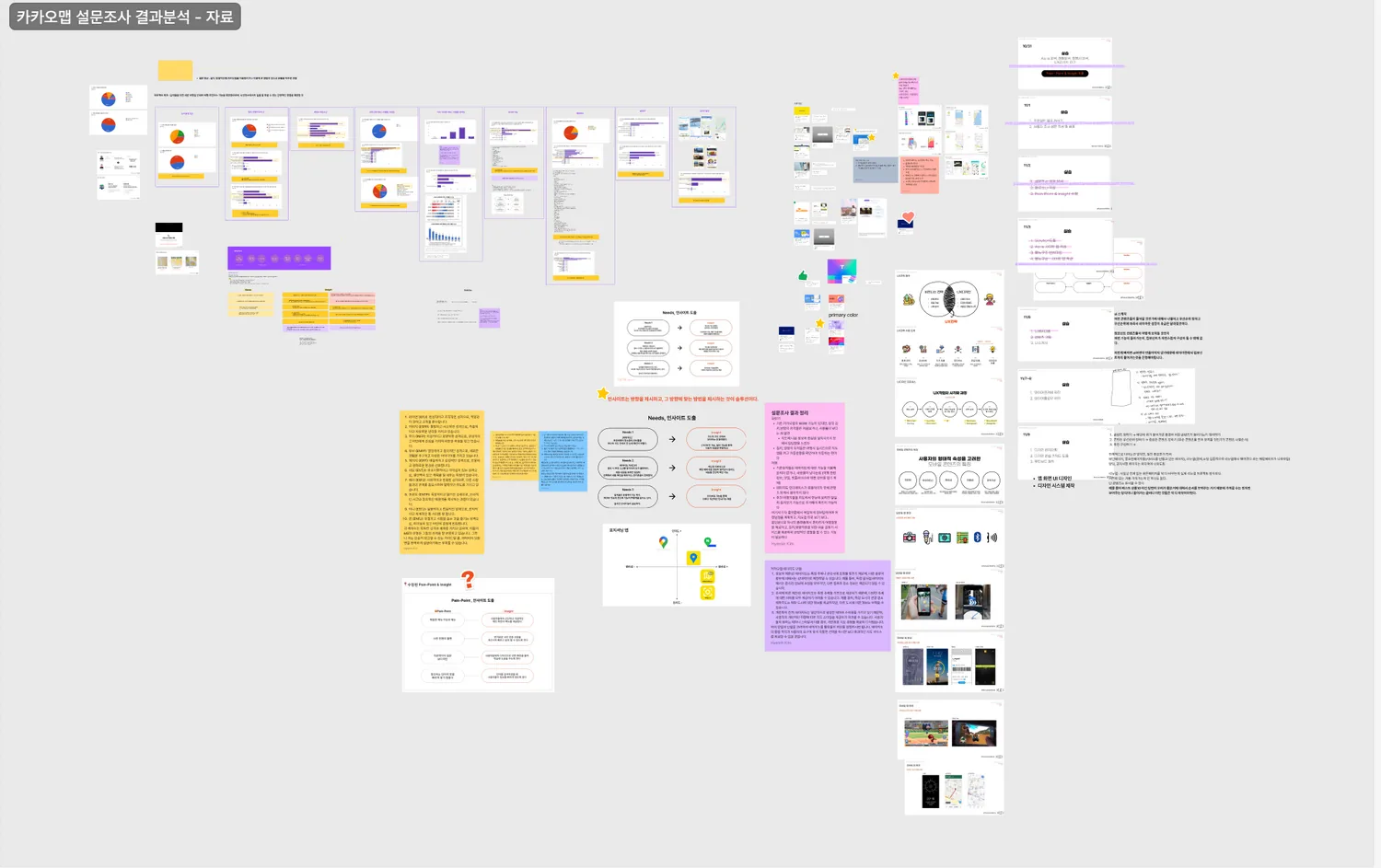
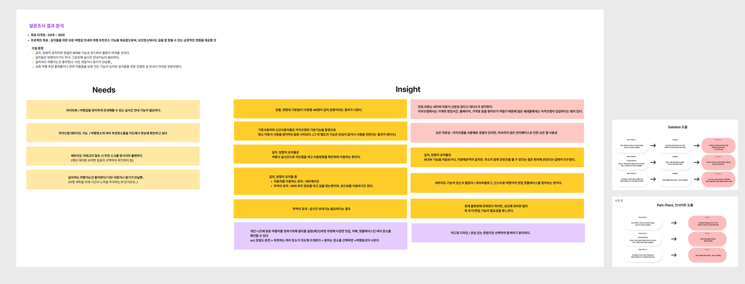
From insight to decision
Insight
Design decision
Travel tools are split across many platforms
Search restaurants, hotels and attractions in one app
Group plans change through endless messages
Shared routes and daily itineraries
Shared costs are hard to keep track of
Built-in shared expense tracking
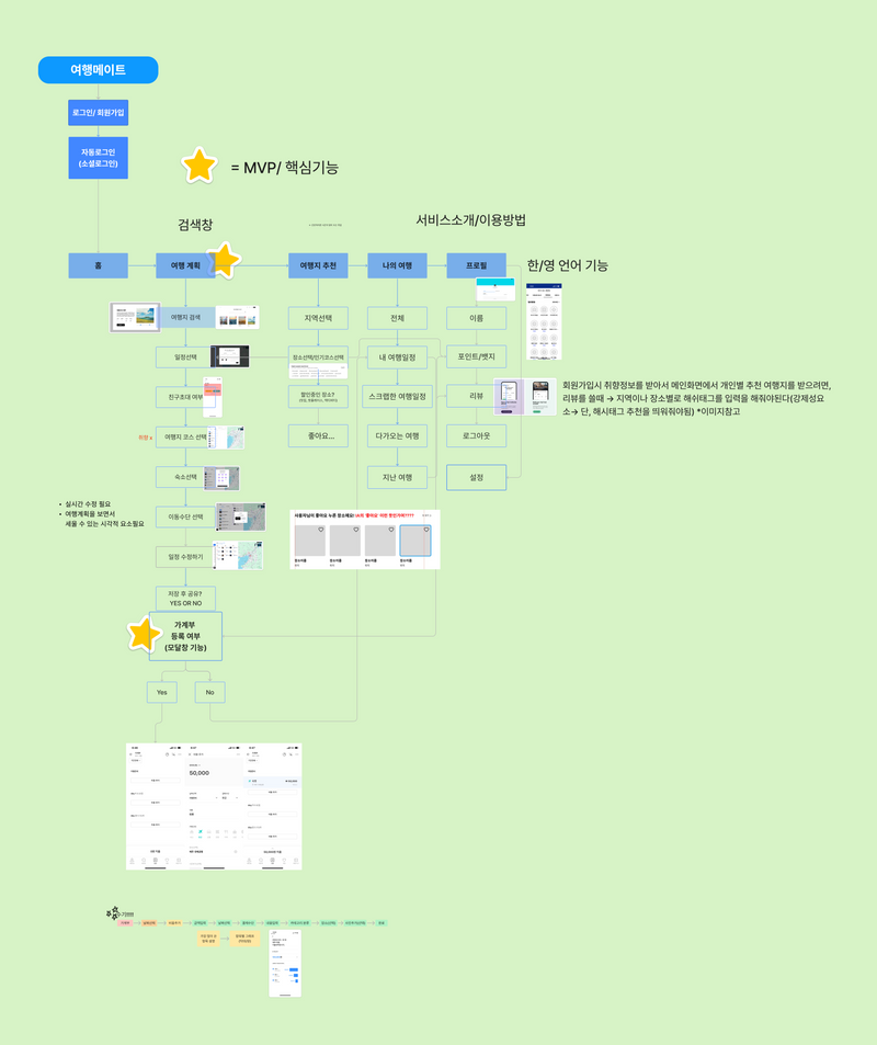
Information architecture
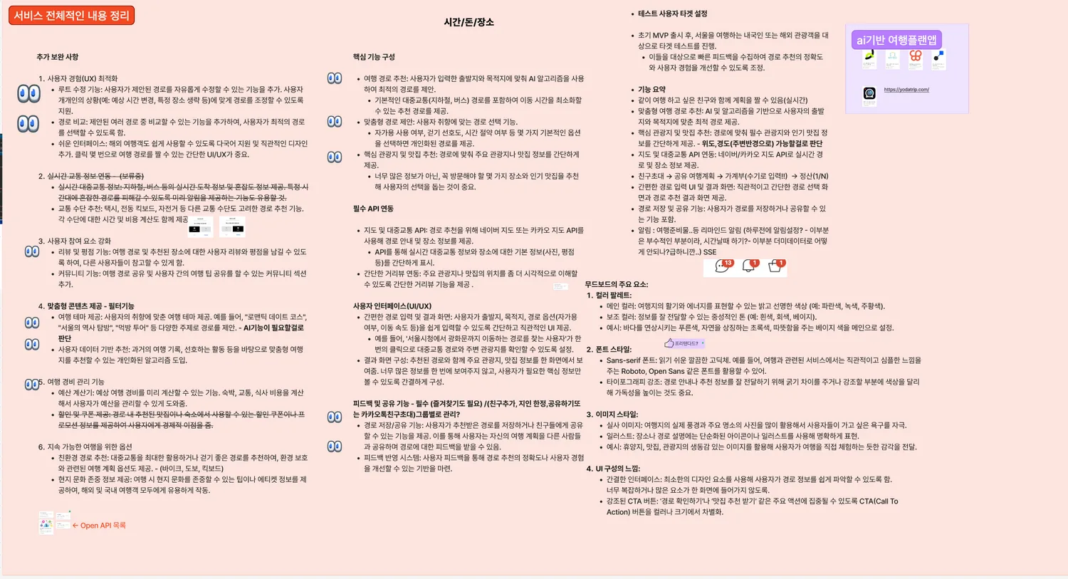
Visual system
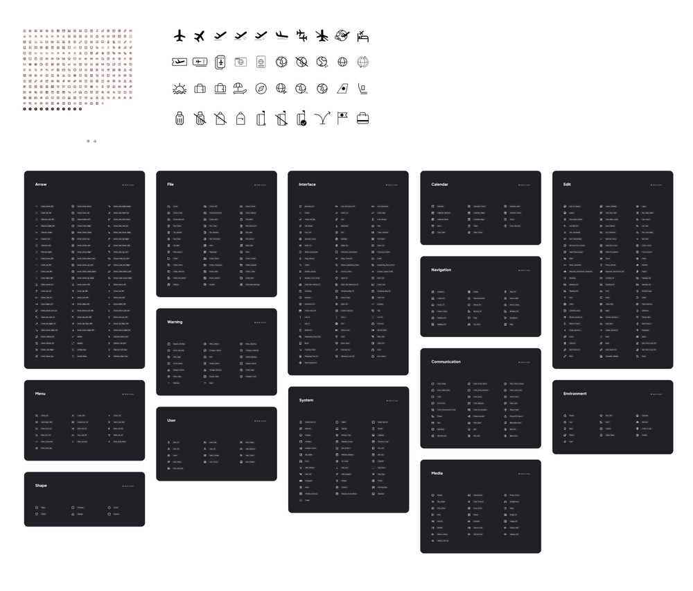
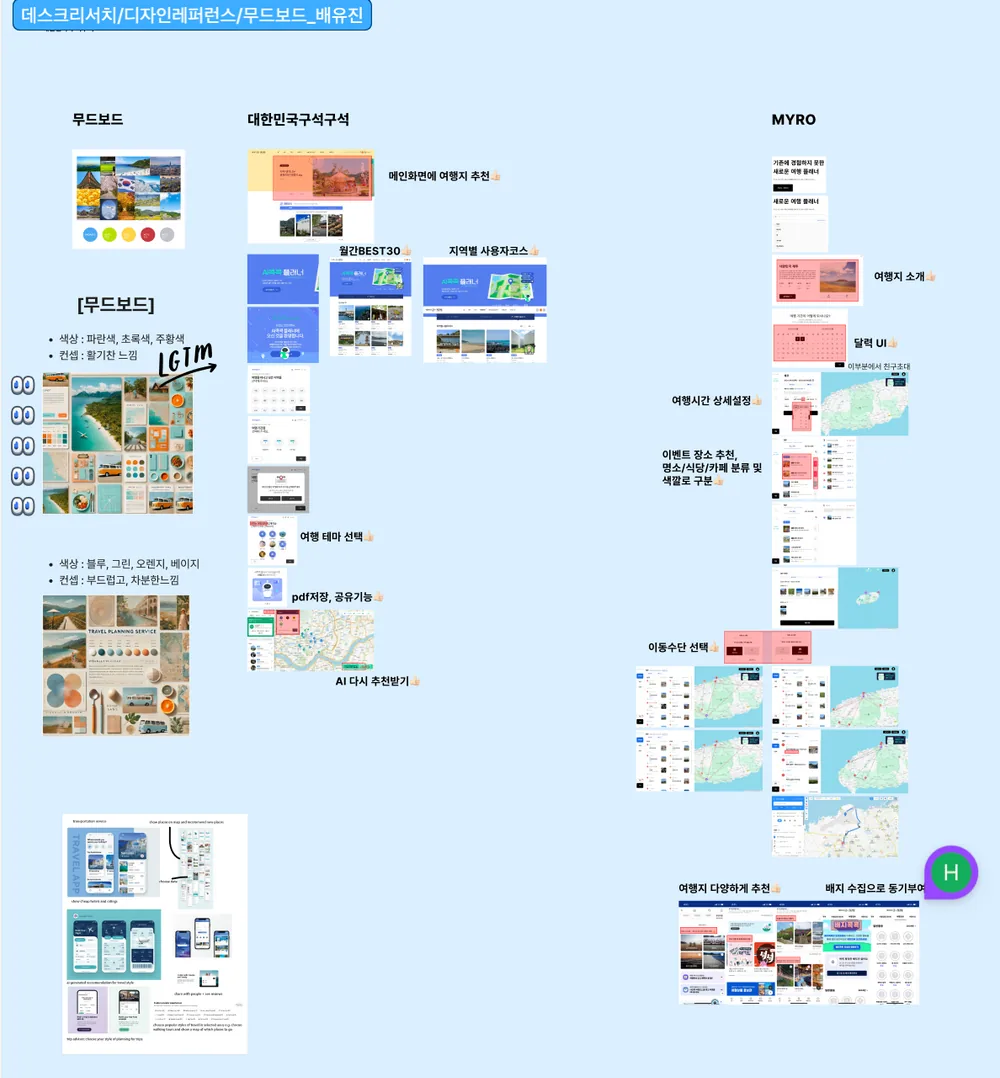
My role: illustration & key screens
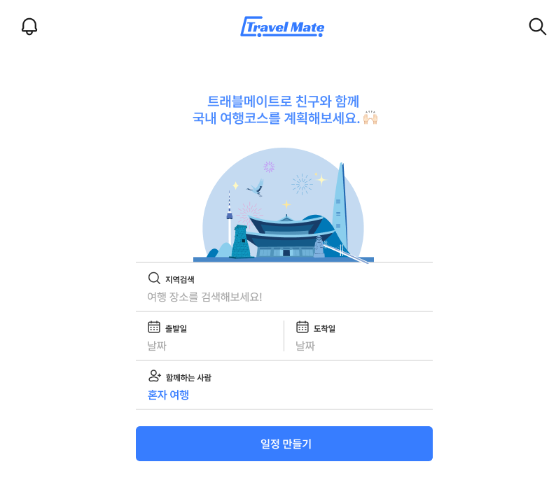
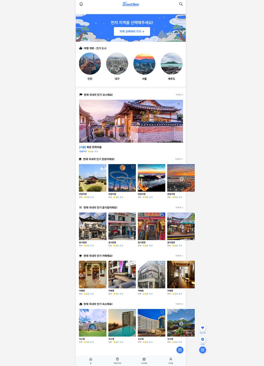
Final screens
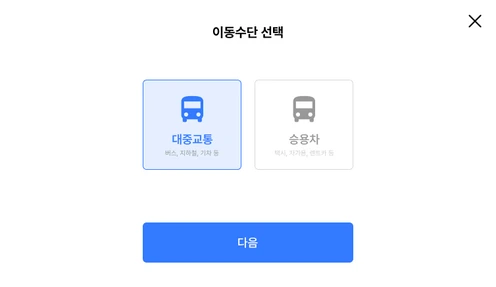
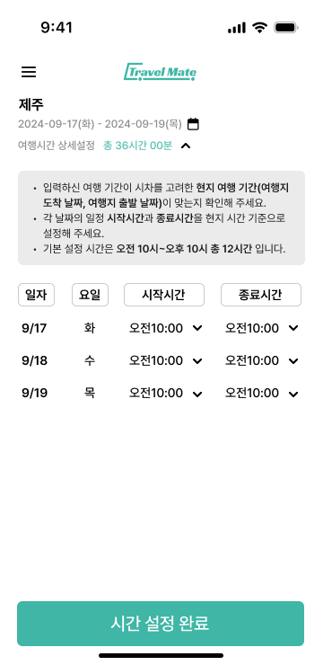
100+ screens designed with two other UX designers. The home screen and the four-step trip setup:
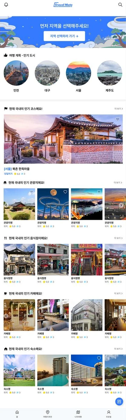
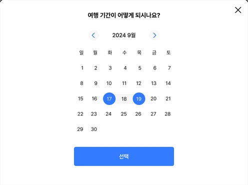
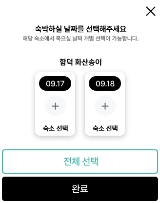
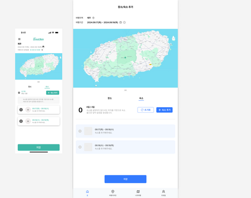
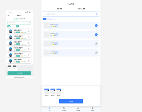
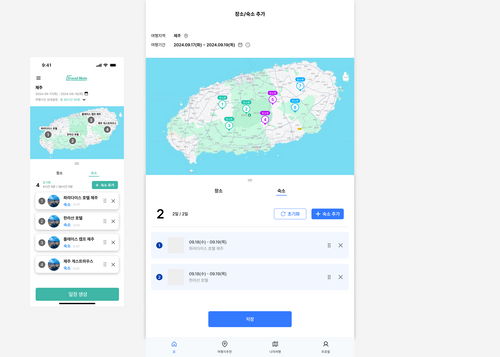
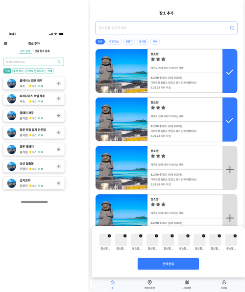
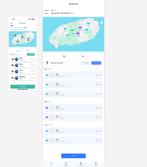
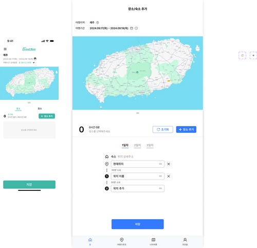
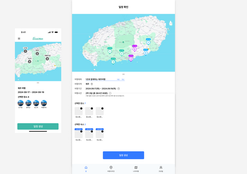
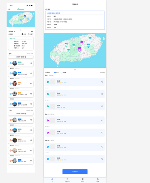
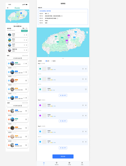
The planning flow, on mobile and tablet
From an empty trip to a shared itinerary, in nine steps.
Designing with developers
Three UX designers worked alongside a front-end and a back-end developer, so every design had to work as a real product.
Design for what can be built
Checking ideas with developers early kept shared itineraries and expense tracking realistic.
One shared system
Consistent icons, colors and components kept 100+ screens consistent and faster to build.
Iterate together
Developer feedback fed directly into 16 rounds of interface iteration.
Process
- 01ResearchSurveys, data, benchmarking
- 02Visual systemIcons & moodboard
- 03IAHome, plan, spots, profile
- 04Wireframes16 iterations
- 05Final screens100+ pages
- 06NextPartnerships & integrations
Next stepsPartner integrations with maps, restaurants and hotels, and expense splitting for groups.